Why Your Pitch Deck Design Matters More Than You Think
You’ve got the numbers, the product, the market insight but if your pitch deck design doesn’t hold attention, none of that gets through.
In early-stage fundraising, design is not a nice-to-have. It’s how you control the narrative. The right visuals, layout and flow make complex ideas feel simple and help investors focus on what matters: your traction, your vision and your potential.
A poorly designed deck can confuse, distract or even turn off investors before you get to your strongest slide. But a clear, compelling deck? It makes them lean in.
What Investors Actually Want to See
Before jumping into design tactics, you need to know what your audience is looking for. Investors review hundreds of decks. Most don’t read every word, they scan for clarity, confidence and consistency.
Here’s what they’re looking for visually and structurally:
- A clear narrative arc: problem, solution, market, product, traction, team, ask
- Confidence in the brand and execution
- Focused, easy-to-follow slides
- Data visualised effectively (not buried in paragraphs)
- Aesthetics that signal maturity and readiness to scale
Your design must support all five.
Design Moves That Make Your Deck Stand Out
1. Lead With Clarity, Not Complexity
The number one mistake founders make is overloading slides with text. But clarity wins deals.
Limit each slide to one core idea. Use large, legible fonts, short bullets and strong headings. Add whitespace. Keep distractions to a minimum.
Great pitch design feels almost too simple, but that simplicity makes it effective.

2. Show, Don’t Just Tell
Words are good. Visuals are better.
Turn data into graphs. Turn user journeys into diagrams. Turn your product into screenshots. Make the intangible real.
If you’re showing traction, don’t just say “50% growth”, visualise it with a chart. If you’re talking product, show the interface. If you’re describing workflow, map it out.
At Blabb Studio, we’ve helped startups like and go from text-heavy decks to visually engaging stories that led directly to investor calls.
3. Nail the First Three Slides
Attention spans are short. If the intro of your deck doesn’t land, the rest might not matter.
The first three slides should:
- Establish the problem clearly
- Position your product as the obvious solution
- Show traction or insight that proves the market is real
From a design standpoint, these slides need to be especially clean, visually interesting and confidence-building. Strong visuals here set the tone for the entire deck.
4. Use UI Screens the Right Way
Including product screenshots is smart but only if they’re used with purpose.
Don’t just throw in a screen grab and hope it impresses. Explain what the user is doing. Call out a feature that drives engagement or solves the core problem.
Your UI should look refined. If it doesn’t, consider building a mockup or enhanced version for the deck. Investors know when they’re looking at MVP spaghetti.
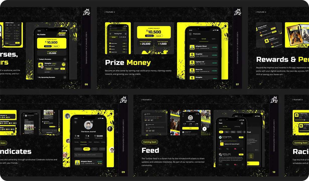
5. Build a Consistent Visual System
You don’t need to be a designer to have a consistent-looking deck. But you do need to choose:
- 1–2 typefaces
- A defined colour palette
- Simple slide templates
- Cohesive icon and image styles
If each slide looks like it came from a different template, it undermines trust. Good design equals perceived stability and cohesion.
This is why many successful decks borrow from their product branding. It keeps everything aligned and familiar.
6. Design for Pitching, Not Just Reading
A pitch deck is different from a memo. If you’re speaking through the deck, your slides should support your voice, not repeat it.
For decks meant to be sent ahead (a “leave-behind” or “cold deck”), you’ll need a bit more copy. But even then, visual flow matters.
Consider:
- Limiting text to digestible chunks
- Breaking complex ideas into 2–3 slides
- Using bold and highlight colours for keywords
- Including CTA slides at key points (e.g. “Want to learn more?”)
7. Reinforce Brand and Voice
Even if your product is pre-launch, your brand matters. A strong visual identity sets you apart and shows confidence in your positioning.
Your pitch design should feel like an extension of your product. Use your logo, brand colours, typefaces and voice. That consistency builds trust.
When we redesigned UnRealXR’s pitch materials, aligning them with their bold AR visual system increased brand memorability, which led to more follow-up calls and a stronger close rate.
What to Avoid in Pitch Deck Design
Even if your content is strong, design can still hurt you if:
- You use 10 different font sizes
- There are too many transitions or animations
- Charts are hard to read or not labelled
- Every slide looks completely different
- UI screenshots are blurry or cluttered
- The colours are not accessible (bad contrast)
Avoid these, and you’ve already beat 80% of decks out there.
Bonus: Fundraising Design Tips from Blabb Studio
We’ve worked with dozens of early-stage teams, from stealth startups to VC-backed SaaS founders and here’s what works again and again:
- Build two versions of your deck: one for talking through, one for sharing
- Create a branded Figma template so new slides are fast and on-brand
- Design with the end in mind: what story are you leaving behind?
- Keep a library of UI components, metrics slides and brand visuals ready
- Add a “Why now” and “Vision” slide with visuals that make investors believe
Final Word: Design Is Your First Pitch
Before you speak, your slides speak for you.
A well-designed pitch deck helps you:
- Get more meetings
- Close faster
- Show confidence and clarity
- Stand out in a crowded inbox
- Turn your vision into something investors can believe in
It’s not just about design, it’s about strategy, storytelling and traction.
Need a pitch deck that turns heads and raises rounds? Talk to Blabbio
About Us
Blabb Studio is a design and development studio built for startup founders. We craft bold, high-conversion pitch decks, investor assets, product UIs and brand systems that help early-stage teams grow fast and raise faster.
From Velora App to XRii, we’ve helped dozens of founders land funding with design that delivers.
To see more of our work, visit blabb.studio/about or contact us to learn how we can help your startup raise with confidence.