Why UI/UX Matters in Fundraising
In early-stage fundraising, first impressions aren’t just important, they’re everything.
Investors form an opinion about your product in the first few seconds of a demo or pitch. Before you explain features or show data, they see your interface. They feel your UX. And they make
subconscious judgments: is this startup credible? Is it ready to scale?
Good UI/UX shows you're ready. Poor design creates doubt and doubt kills deals.
Design is not just what something looks like. It is how well it works, how clearly it communicates value and how it signals capability. For investors, that visual and functional polish is proof of execution. It shows that you're serious, strategic and trustworthy.
What Investors Look for in UI/UX
While investors may not all be design experts, they instinctively notice red flags and green lights in your product’s interface.
Here’s what great UI/UX communicates to investors:
- Clarity of value proposition Can users immediately understand what the product does?
- Strong product thinking Are key features prominent? Are flows prioritised?
- User empathy Is the product intuitive and helpful, or is it built only for insiders?
- Scalability Is the UI consistent and flexible enough to grow with new features?
- Execution ability Does the design feel refined and deliberate?
If your product feels like a patchwork or MVP rushed to market, investors will assume your startup lacks process. On the other hand, a cohesive, focused product experience makes them feel confident in your team’s ability to build, grow and lead.
Strategic UI/UX Moves That Impress Investors
To elevate your product for funding, design choices need to support your narrative. Here are strategies that go beyond “looking good” and focus on what really matters.
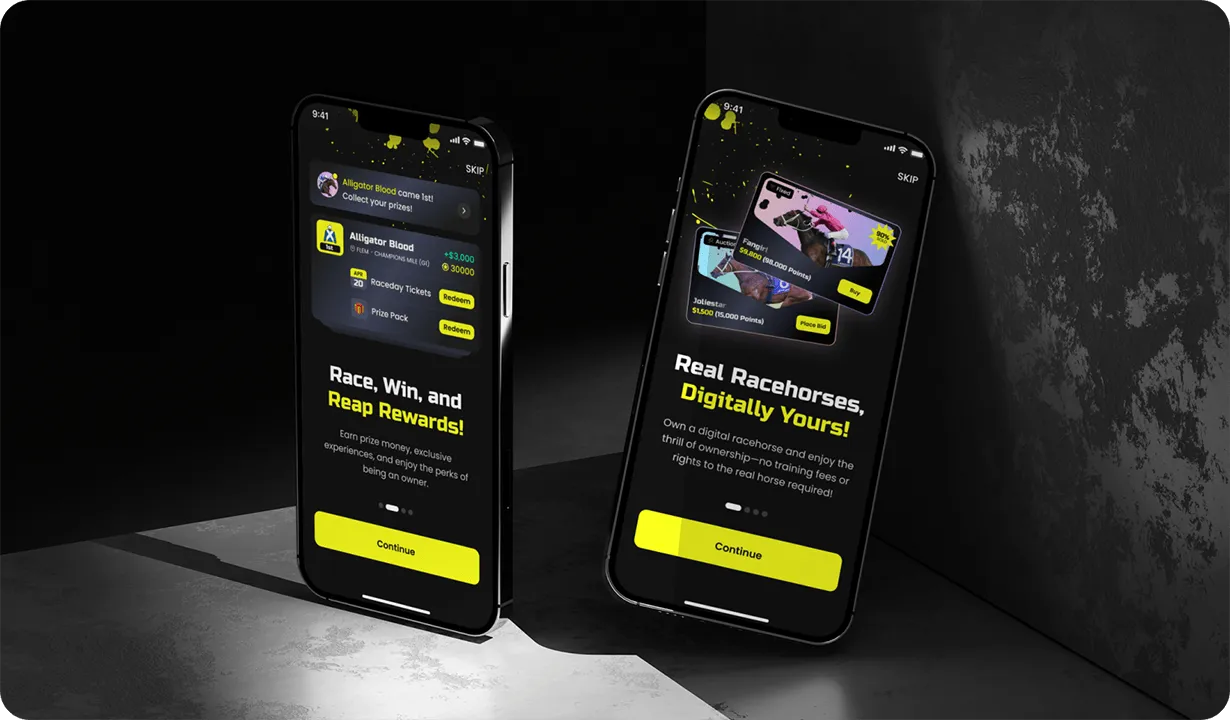
1. Prioritise the “First Value” Moment
Investors want to know that users understand and benefit from your product quickly.
Your UI should guide users to that “aha!” moment, when they first experience value, with minimal friction.
To do this:
- Make the first screen clean and focused
- Use short, visual onboarding (progress bars, contextual tips)
- Highlight what action users should take next
- Preload helpful defaults where possible
This signals a mature product mindset, you’re not just building features, you’re guiding outcomes.
2. Design for Clarity, Not Complexity
Many founders overdesign to show off capability. But complexity backfires.
Good UI focuses the user's attention. It removes unnecessary decision-making and reduces visual noise. This not only helps real users, but also makes your pitch clearer.
Use:
- Generous whitespace
- Simple, accessible colour schemes
- One clear action per screen
- Typography that supports hierarchy
If your UI feels overwhelming or cluttered, investors will struggle to understand your flow and if they don’t get it, they won’t fund it.
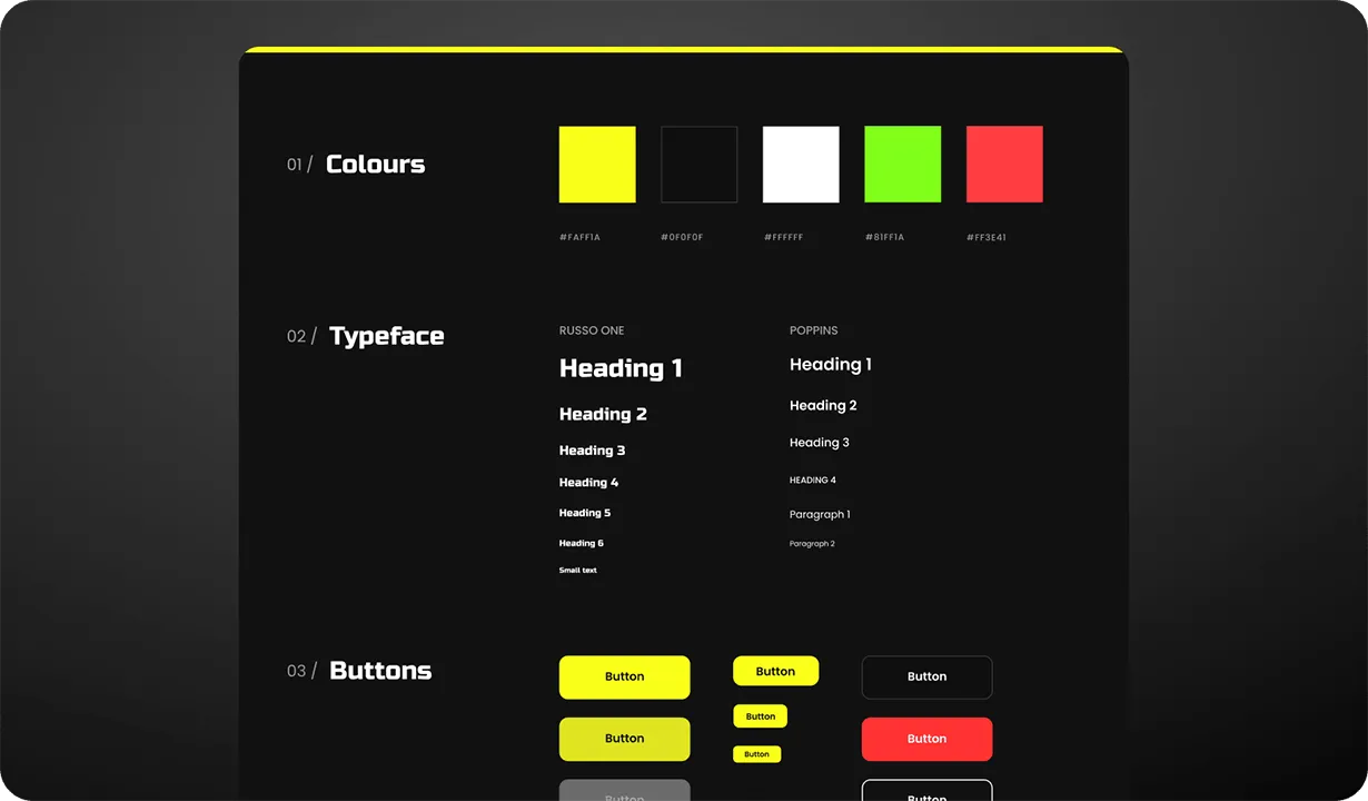
3. Create a Consistent, Scalable Design System
Consistency is a major credibility signal.
If your buttons change style screen to screen, or your brand tone shifts between pages, it looks rushed. Investors see this as technical or operational debt.
Build a basic design system with:
- A defined colour palette and typography
- Standardised component styles (buttons, forms, alerts)
- Reusable layouts for speed and scalability
At Blabb Studio, we’ve helped dozens of startups build systems like these, including and
, both of whom went on to win awards and raise funding with UI that scaled with their growth.
4. Align UX with Traction Metrics
Good UX isn’t just easier to use, it improves your numbers.
Your interface should be designed to support:
- Higher signup and activation rates
- Lower bounce and drop-off
- Faster trial-to-paid conversion
That means designing with clear calls to action, logical user journeys and contextual nudges. Show investors that you’re not just building a product, you’re building momentum.
When we redesigned the app flows for DraftBet, for example, improved UX directly boosted signups and cut support requests in half. Those metrics strengthened their funding pitch and proved product-market readiness.
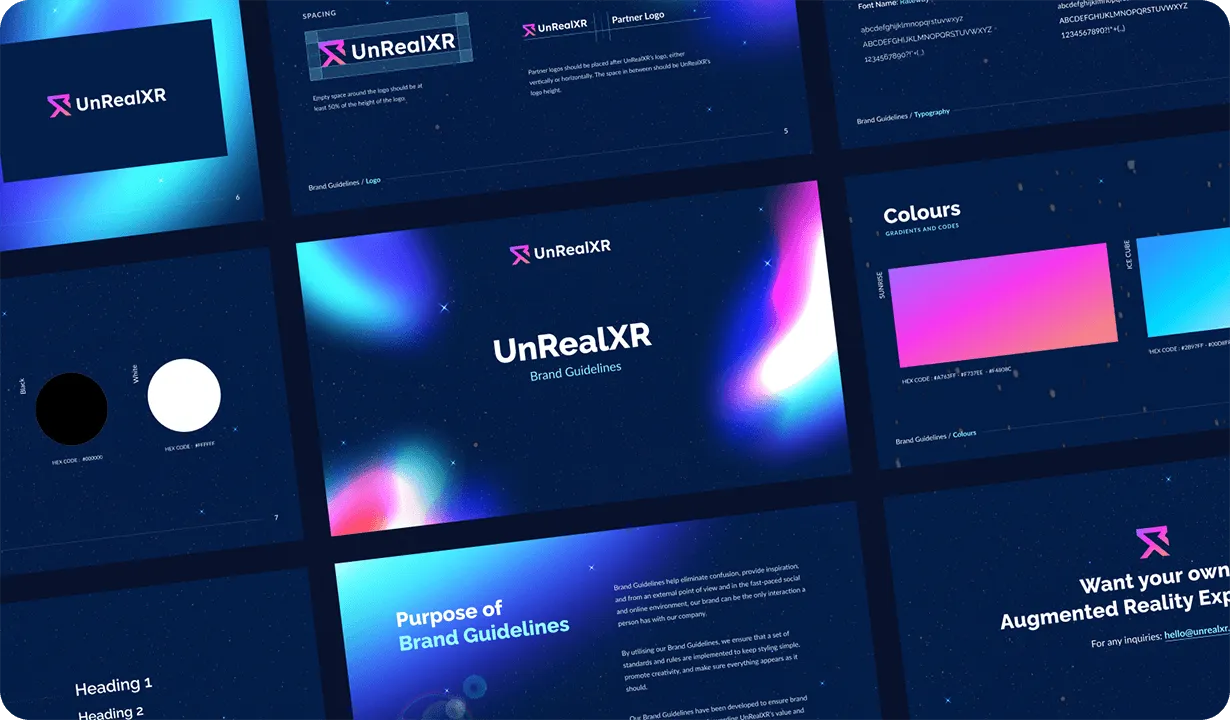
5. Match the Brand to the Vision
A common disconnect in early startups is a mismatch between the ambition of the idea and the quality of the design.
If your product aims to disrupt an industry, your design needs to reflect that boldness. Not through gimmicks, but with conviction, confidence and taste.
Consider:
- Strong, ownable visual identity
- Professional typography and iconography
- Animation or motion to signal interactivity
- Crisp visuals in your pitch deck and product demo
When we rebranded , their product instantly felt like a leader in the AR space. The identity aligned with their innovation, making the brand as disruptive as the technology behind it.
How UI/UX Supports Your Pitch Deck
Your pitch deck should showcase more than financials and TAM.
A product slide with a polished UI screenshot does more than words. It shows:
- You can execute
- You understand users
- You’re ready for growth
If you have a live demo, great UX keeps investors engaged longer and helps them understand your product’s value faster.
Make sure to include:
- UI screenshots that are clear and consistent
- Live product walkthroughs if possible
- Metrics from UX improvements (drop-off rate, conversion)
- Testimonials or feedback from real users on experience
Common UI/UX Mistakes That Undermine Trust
Even well-built products can feel amateur if these aren’t addressed:
- Misaligned UI components (inconsistent button styles, spacing)
- Overuse of jargon or slang in microcopy
- Poor mobile optimisation
- No visual hierarchy (everything looks equally important)
- Missing or unclear onboarding
You don’t need perfection. But you do need polish and intention.
Final Word: Good UI Doesn’t Just Look Fundable, It Is
Great UI/UX shows that you care about the details. It proves that you're not just building for users, you're building with users in mind.
If your startup is heading into a raise, design should be part of your fundraising strategy, not just a cosmetic touch.
Smart UI/UX helps you:
- Build trust faster
- Communicate value clearly
- Improve user behaviour metrics
- Reduce risk signals
- Strengthen your investor narrative
Your product doesn’t have to be perfect. But it does have to look like it’s ready for the next level.
If you’re ready to elevate your UI/UX and build investor confidence from first click to final slide, Talk to Blabbio
About Us
Blabb Studio is a spicy design and development partner for startup founders. We help high-growth teams craft UI/UX that converts, scales and secures investment. From Figma to Webflow, our team designs experiences that feel sharp, strategic and fun.
We’ve partnered with over 50 brands, including Shopify, TurfStar, DraftBet and UnRealXR, to transform early-stage products into fundable, high-growth digital experiences.
To see more of our work, visit blabb.studio/about or contact us to learn how we can help your startup grow.