Why Startup Websites Are Make-or-Break
Your startup website is not just a digital brochure. It is your first impression, your pitch deck, and your conversion engine. In the early days, most people will experience your brand for the first time through your website. Whether they stay, scroll, sign up, or bounce is decided in a matter of seconds.
Good websites convert. Great websites build credibility, explain value instantly, and move users toward action. A poor site introduces doubt. And in early-stage growth, doubt kills deals.
We’ve learned this after designing for dozens of founders, including , a fintech app helping families manage every dollar with confidence and zero stress.
What Actually Makes a Website Convert
1. Clear, Fast Value Proposition
Most startup websites fail because they try to say too much too early. In the first scroll, users should instantly understand:
- What the product does
- Who it’s for
- What outcome it delivers
If they can't answer those questions in under five seconds, they’ll bounce.
What works:
- A strong headline with a clear benefit
- One sharp supporting line
- A primary call-to-action (CTA) above the fold
- Simple product visuals or animation
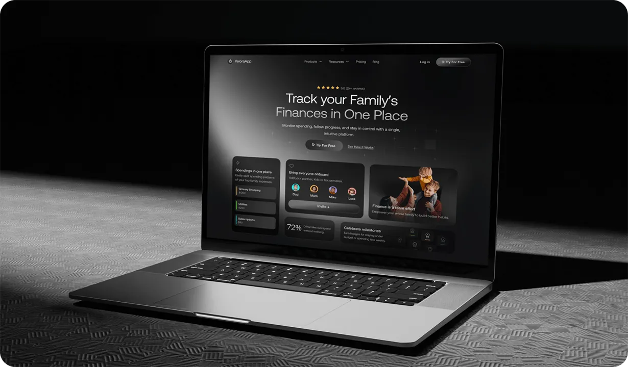
Velora’s homepage leads with a calming promise: “Track family's finances in one place.” In one line, it explains what it is, who it’s for, and why it matters. The design supports that message with clean typography, plenty of space and no clutter.
2. Scroll-Driven Narrative
The best startup websites tell a story as users scroll. They guide visitors from interest to understanding to action.
That story usually includes:
- Value clarity – Why should I care?
- Trust signals – Who else uses this?
- Feature proof – How does it work?
- Product visuals – What does it look like?
- Call to action – What should I do next?
Velora’s site moves from value to social proof to app visuals with ease. The layout is clean, and the language is calm and reassuring. The result is confident storytelling that makes users want to engage.
3. Mobile-First UX That Feels Effortless
Most startup traffic comes from mobile. If your site breaks, stutters or hides key info on small screens, you are losing users fast.
Designing mobile-first means:
- Prioritising readability and spacing
- Ensuring CTA buttons are thumb-friendly
- Keeping load times low
- Simplifying content for small screens
Velora’s mobile site feels light and fast. It delivers information without overwhelming the user. Buttons are well-placed, animations are subtle and the layout responds smoothly to different devices.
4. Design That Matches Your Brand’s Voice
If your product feels smart, your website should feel smart. If your brand is calming, your design should reinforce that emotion. Inconsistency between product and site breaks trust and weakens brand clarity.
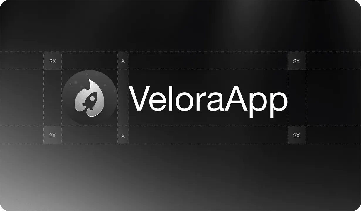
Velora’s brand needed to say: “We’ve got your back.” It had to feel in control, calm and helpful, not like another fintech shouting for attention. We delivered a soft colour palette, clean lines and a strong tone of clarity.
When users feel that emotional match, they trust you faster.
5. Custom Visuals Over Generic Templates
Templates can work for quick MVPs. But serious startups need to build credibility fast. That means using real visuals like custom mockups, animations and product walkthroughs, not generic stock photos or reused blocks.
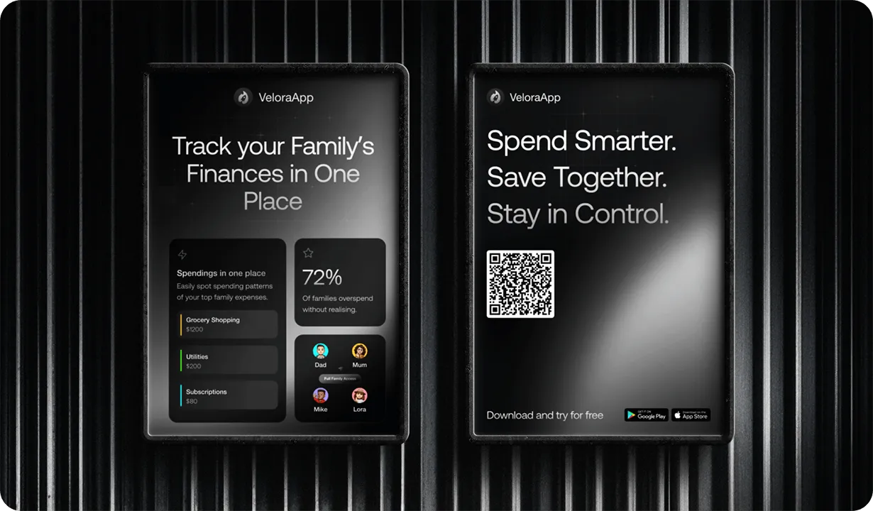
Velora does this well. Their visuals show real UI and the emotional benefit of using the app. It looks like a trustworthy, working product, not a concept.
What Founders Should Avoid
The most common startup website mistakes include:
- Unclear messaging – No one knows what you do
- Text overload – Walls of copy kill attention
- Weak CTAs – “Learn more” is not enough
- Off-brand visuals – Don’t feel like your actual product
- Overused templates – Make you look like every other startup
Founders often wait too long to invest in design. But at this stage, perception equals trust.
How to Know Your Website Is Working
Conversion is not guesswork. Your website should be tracked, tested and improved like any part of your product.
Key metrics to measure:
- Bounce rate – High numbers suggest confusion
- Time on site – Short visits mean low engagement
- CTA click-through – Shows whether your copy and design are working
- Signup/demo submissions – Your core conversion goal
Startups often rely on tools like Hotjar, Google Analytics or Fathom to test layouts and optimise user flow.
Case Study: Velora’s Website That Works
Velora came to Blabb Studio with a great product but an outdated site. Their value was getting lost in clutter. We worked with their team to bring clarity and calm to their online presence.
We delivered:
- A confident brand identity and colour system
- Clean, mobile-first Webflow development
- A scroll-based narrative that builds trust
- Real product mockups showing in-app value
- Campaign-ready visuals for investor and user outreach
The result? A website that converts. A brand that feels real. And a product that earns loyalty.
Startup Website Checklist
Before you launch or relaunch, run through this:
- Headline explains value in five seconds or less
- Scroll path tells a clear product story
- Site is responsive and fast on mobile
- Visuals reflect your actual product
- Call-to-action buttons are clear and easy to find
- Proof points like testimonials or awards are visible
- Analytics are tracking real engagement
- Messaging matches your product experience
- Pages load fast and look clean
You do not need a huge site. You need a strong one. Especially early on.
About Us
Blabb Studio is a design and Webflow development studio for startup founders. We help early-stage teams create websites, products and brands that build credibility, earn trust and drive conversion..
We’ve worked with over fifty fast-moving startups including Velora, XRii, DraftBet and TurfStar. Our goal is simple: help founders look real, grow faster and raise smarter.
To see more of our work, visit blabb.studio/about or contact us to learn how we can help your startup grow.